Our first case study is a geographic visualization of the MBone, the Internet's multicast backbone topology. It allows efficient transmission of real-time video and audio streams such as conferences, meetings, congressional sessions, and NASA shuttle launches. The MBone is an interesting domain that shares many characteristics with the global Internet, but provides a much more manageable testbed because it is several orders of magnitude smaller. They both have experimental origins, exponential growth rates, and bottom-up growth without planning by a central authority. The latter property has led to a tunnel structure that is not optimal and hard to decipher. We built a visualization system to help maintainers more accurately understand the large-scale geographic structure of the MBone.
This chapter begins with a discussion of the task that we addressed with the Planet Multicast system in section 4.1. We next discuss our choice of spatial layout in section 4.2: we created a geographic representation of the tunnel structure as arcs on a globe by resolving the latitude and longitude of MBone routers. In section 4.3 we move on to visual encoding and interaction techniques such as grouping and thresholding. Section 4.4 is devoted to more specifics about the implementation. The chapter concludes with a discussion of the results and outcomes of the project in section 4.5.
The Planet Multicast visualization was aimed at helping the maintainers find badly configured parts of the MBone topology that wasted scarce resources.
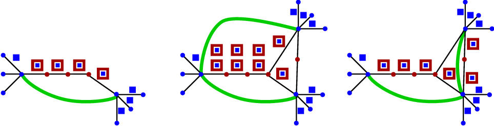
The MBone is the multicast backbone of the Internet. Multicasting is a network distribution methodology that efficiently transmits data from a single source to multiple receivers. The Internet routing protocols were originally designed to support unicast packets: that is, one-to-one communication from a single source to a single destination. The left of Figure 4.1 shows a simple example of unicast routing, which works well for applications such as email. However, these protocols are extremely inefficient when the same data is sent to many receivers, since the traffic load on the network increases linearly with the number of receivers, as in the middle of Figure 4.1.
The multicast routing protocol [CD85] dynamically manages a spanning tree over the links of its network. This tree ensures that identical data is sent only once across each multicast link, as shown on the right in Figure 4.1: data is replicated only as necessary when the spanning tree splits into multiple paths.
Such efficiency is important if there are a large number of destinations, or the data requires high bandwidth (for instance, video or audio streams), or both. The space shuttle launch video footage multicast by NASA to a large number of receivers is a canonical example. Many conferences, seminars, and other events are now viewable remotely thanks to the MBone, and it may see increasing usage as a communication mechanism for networked multi-user 3D applications.
Figure 2.1: Transport protocols. Left: Unicast packet transport (shown here in red) was designed for one-to-one communication. Middle: Unicast packets sent from one source to multiple destinations results in congestion. Right: Multicast transport protocols allow packets (shown here in blue) to flow from one source to multiple destinations efficiently by dynamically maintaining a spanning tree of network links.
Figure 2.2: Tunnelling. Left: A tunnel (shown in green) allows new-style packets (blue) to traverse legacy infrastructure encapsulated in old-style packets (red), so that network improvements can be gradually deployed. Middle: A poor choice of tunnel placement, where identical packets traverse the same unicast link. Right: A more intelligent placement choice, where tunnels tie together islands of new infrastructure.
Adding new capabilities to the global Internet is difficult since simultaneously upgrading every single machine is not feasible. Since machines are upgraded piecemeal according to the schedule of local administrators, noncontiguous islands of new infrastructure must be connected by an overlay of virtual logical links, or tunnels, on top of the existing network. A schematic view of a tunnel is shown on the left of Figure 4.2. New-style data packets can move freely between machines that have been upgraded, but must be encapsulated at one end of the tunnel into old-style packets in order to be properly routed through the old infrastructure. These packets are unpacked at the other end of the tunnel, where the routers with the new capabilities can take over again.
Only some production Internet routers supported native multicast in 1996. The MBone was designed to provide interim support by using tunnels between routers that have been upgraded to support multicast, and those that are capable only of unicast routing. Multicast packets are encapsulated into normal Internet Protocol (IP) [Pos81] packets at an MBone tunnel endpoint.
MBone tunnels are intended to stitch together the parts of the Internet that have not been upgraded to native multicast support. Tunnels should be placed so that they traverse the old infrastructure as little as possible, just long enough to get to the nearest available multicast router. Careful tunnel placement is important since the multicast protocol determines the shortest paths through its spanning tree based on the tunnel hop count rather than the underlying unicast hop count. The most efficient placement of a tunnel results in encapsulated multicast packets travelling on uncongested unicast links that do not have any other tunnels overlaid on top of them. Since tunnels are opaque to the multicast protocol, more than one tunnel overlaid on a single unicast link will result in multiple multicast packets of identical data passing through that link. The middle and right of Figure 4.2 show a comparison of good and bad tunnel placement.
However, there is no central arbiter of tunnel placement: the only coordination required in setting up a new tunnel is finding a willing network administrator at the other endpoint. The result is that some new tunnels are placed haphazardly, and in the worst case may even use unicast links that already have a tunnel overlay. The rapidly changing nature of Internet complicates the tunnel placement task. A tunnel that connected two multicast-enabled islands via an uncongested high bandwidth unicast path six months ago might now be routed through a different, more congested unicast path. Moreover, some of the intervening routers may have been upgraded to support multicast, so the single long-distance link should ideally be split into two shorter tunnels.
The primary intended audience for the Planet Multicast visualization system was the core MBone developers and maintainers. Our goal was to help with the maintenance task of finding badly placed tunnels that might be causing distribution inefficiencies by wasting bandwidth. As the size of the MBone grew and Internet congestion became increasingly problematic, there was greater incentive to tune tunnel placement to provide the most efficient distribution topology and minimize the imposed Internet workload.
Although the MBone maintainers have no formal authority, they can and do make suggestions, which are usually followed. A secondary goal was help people joining the MBone who need to find a good place to connect a new tunnel.
In the beginning the MBone was a new and small enough system that
maintaining detailed maps of its topology did not require a
sophisticated infrastructure. The early mapmaking projects, which
culminated in a four-page PostScript printout meant to be hand-tiled,
were abandoned in mid-1993.![]()
Since the MBone is now too large to be manually indexed, the only
way to discover its topology is through active
detection. The mwatch program developed by Atanu Ghosh at
University College London lists the IP addresses (and often hostnames)
of multicast routers at tunnel endpoints. Piete Brooks at the
University of Cambridge used this tool to traverse the topology of the
MBone every night.![]()
![]() We
were able to augment the Cambridge list with information about MBone
routers in a few firewalled private networks thanks to help from
one of the MBone maintainers. Hidden within this large dataset were
highly suboptimal tunnel placements, misconfigurations, and outdated
parts of the MBone topology that should be removed. As of June 1996,
the MBone topology dataset consisted of over 75 pages of textual data
of the form shown in Table 4.1.
We
were able to augment the Cambridge list with information about MBone
routers in a few firewalled private networks thanks to help from
one of the MBone maintainers. Hidden within this large dataset were
highly suboptimal tunnel placements, misconfigurations, and outdated
parts of the MBone topology that should be removed. As of June 1996,
the MBone topology dataset consisted of over 75 pages of textual data
of the form shown in Table 4.1.
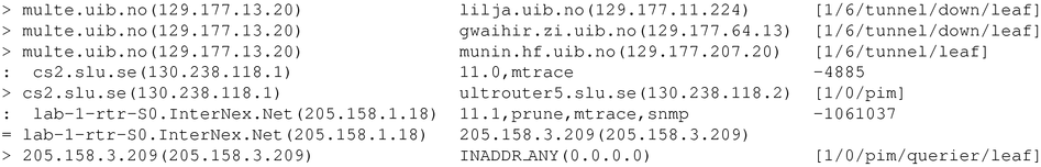
Table 4.1: Raw tunnel data from mwatch. The MBone topology
data from June 1996 consisted of over 75 pages of textual data in this
form.
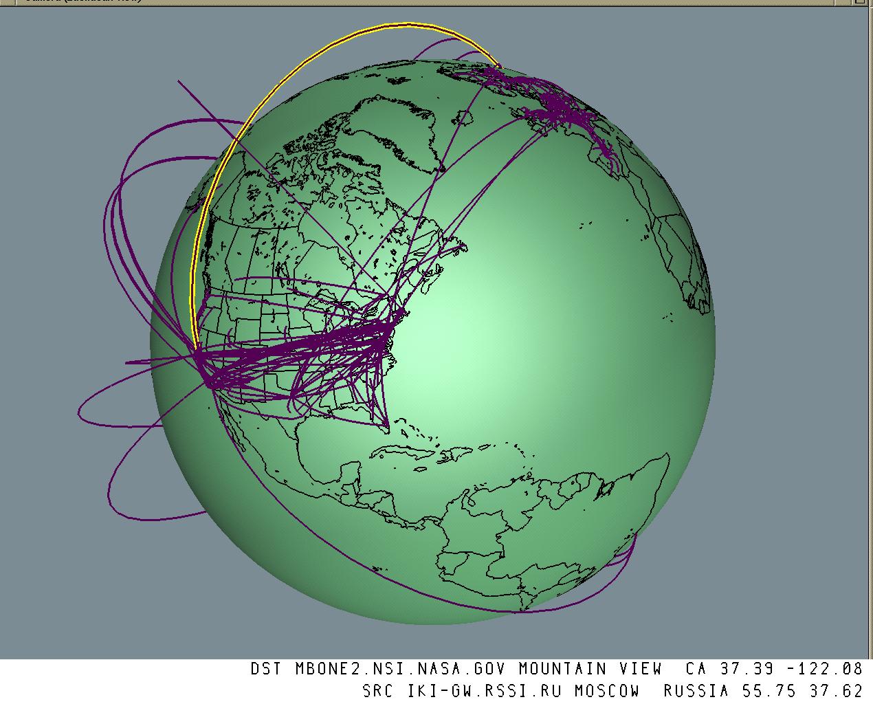
Planet Multicast showed the MBone tunnel topology using the visual metaphor of arcs rising from a 3D globe, with detail-on-demand hypertext associated with each arc. Figure 4.3 shows this straightforward visualization scheme, which deliberately emphasizes the salience of geographic distance. This simple approach was quite effective, despite being neither novel nor algorithmically complex. Immediate comprehension is one of the great advantages of this highly literal representation: users need little or no explanation of the visual encoding.
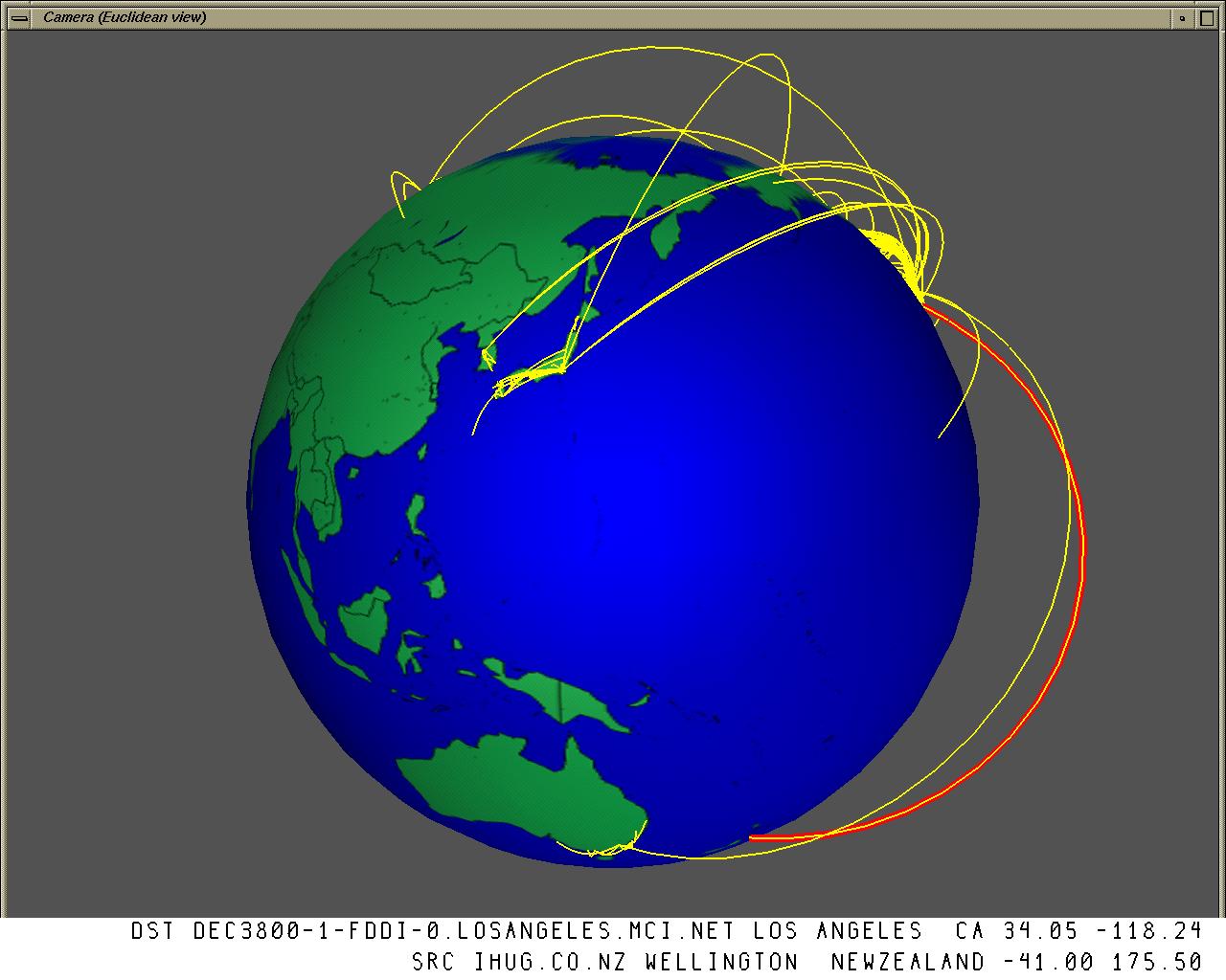
Figure 2.3: MBone shown as arcs on a globe. A 3D interactive map of the MBone tunnel structure, drawn as arcs on a globe. The endpoints of the tunnels are drawn at the determined geographic locations of the MBone router machines. In this and all figures not otherwise labeled, we draw nearly 700 of the 4400 tunnels comprising the MBone on June 15, 1996. Over 3200 are not drawn because we have determined the endpoints to be co-located, whereas the remaining 500 are ignored because we were unable to find their geographic position. The text window below shows the hostname, city and state or country name, latitude, and longitude of the endpoints of the highlighted tunnel, which was interactively selected by the user's click. A URL pointing to this information is bound to the 3D representation of each tunnel.
Badly placed long-distance tunnels are more likely to cause problems than misplaced tunnels that span only a short geographic distance. Long-distance tunnels are likely to contain more unicast hops, and at least one of those unicast hops must itself span a long distance. The longest-distance unicast links are often between continents. Such links are a scarce resource since they are limited in number and often congested. Moreover, if multiple MBone tunnels exist between two widely disparate geographic locations, the chance that more than one tunnel is routed through some single unicast link is higher than if the tunnels are local.
Since geographic distance is weakly correlated with resource usage, we chose to emphasize it in our visualization. We might have chosen a different approach if we had access to resource usage data, but gathering information about the underlying unicast links in the global Internet would have been prohibitively difficult, so no such data was available.
There are two related implications of the arcs-on-globe visual metaphor choice: salience and filtering. The longest distance tunnels are deliberately the most visually salient. The inverse is also true: short-distance tunnels not at all visually salient (and indeed are not drawn at all). Tunnels that have both endpoints in the same city would be imperceptible on our global scale, therefore we draw tunnels only between two different cities.
Thus, our choice of visual metaphor acts as an implicit visual filter that reduces the dataset considerably before rendering: in Figure 4.3, 3200 of the roughly 4400 tunnels are not drawn because they are within the same city. (700 tunnels are drawn, and we were unable to determine a geographic position for the remaining 500.)
Both of these related properties of the geographic metaphor fit with our assumption that distance is correlated to unicast resource usage. However, we also know that this correlation is weak, which means that this visual metaphor is only partially matched with the underlying task of ensuring multicast distribution efficiency.
One advantage of using a 3D globe instead of a 2D birdseye map is that it reduces clutter by occluding one hemisphere. Put another way, rotating the globe around its own axis is an explicit visual filter that controls which hemisphere is visible at any one time. Although the occlusion could be problematic since it precludes an overview of the entire dataset, such an overview is usually unnecessary for the more local task of finding long-distance tunnels. Tunnels that pass between the front and occluded hemispheres are visually salient despite having only one visible endpoint. Since the interactive interface provides hypertext details on demand in response to a mouse click on a tunnel arc, there is no need to navigate to the other endpoint.
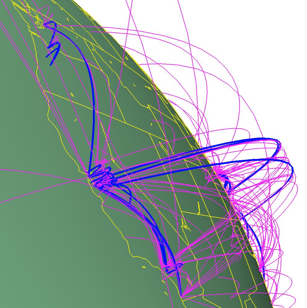
Figure 2.4: Horizon view, arc height and grouping. Three visualization techniques are used in this figure: distance-based arc height, 3D navigation and grouping. The ``horizon view'' results from zooming close and clicking on a point on the earth's surface to act as the center of rotation. Moving our eyepoint close to the earth also emphasizes the different arc heights. Finally, the group of tunnels running the PIM protocol are drawn with a different color and linewidth than the rest.
When we tried mapping the tunnels on a standard 2D world map, the lines representing the tunnels were far too dense to allow for interpretation. The clutter was particularly severe because long-distance tunnels between North America and the Pacific stretched across the entire map, occluding important information about European tunnels. Thus, the hemispherical occlusion of the globe is actively useful.
Another important advantage of using a globe is the ability to rotate around a point on its surface for a horizon view, as in Figure 4.4. The oblique viewpoint allows the user to see the varying arc heights clearly at a local level, which is useful for improving the visibility of shorter tunnels.
We use a globe constructed by Stuart Levy using the CIA World Map
database. Most of the figures show outlines of the continents drawn on
a solid-colored sphere. Figure 4.5 shows two uses of
texture maps, which lead to increased computational requirements on
machines that do not have hardware texturing support.![]() Photorealistic
texture maps that include geographic features introduce visual clutter
that is extraneous to the visualization task. However, the more
abstract texture that distinguishes land from water can serve a useful
purpose.
Photorealistic
texture maps that include geographic features introduce visual clutter
that is extraneous to the visualization task. However, the more
abstract texture that distinguishes land from water can serve a useful
purpose.
Figure 2.5: Textured globes. Left: A more photorealistic texture map offers a familiar global picture but introduces extraneous visual clutter and requires more computational resources. Right: A more abstract texture is still too computationally intensive for low-end platforms, but it is easier to distinguish land from water than on a globe with only vectors for continental outlines.
Computing the spatial position of arcs on a globe reduces to 2D
spherical trigonometry. We convert the latitude and longitude of the
two tunnel endpoints into spherical coordinates  , and
find the shortest geodesic arc on the surface of a unit sphere between
those two two points. We then loft the geodesic to a maximum height
h that depends on its length. The arc geometry is created as a
controllable number of piecewise linear segments.
, and
find the shortest geodesic arc on the surface of a unit sphere between
those two two points. We then loft the geodesic to a maximum height
h that depends on its length. The arc geometry is created as a
controllable number of piecewise linear segments.
We use the same equation as the SeeNet3D system [CE95] for computing the lofted height of the arc:

The parameter t ranges from 0 to 1 along the arc path.
We briefly experimented with using the same height for all arcs, but
the display quickly became overly cluttered. Having the arc height
depend on its length lends visual emphasis to long arcs, an advantage
for our application since we want long-distance tunnels to stand out.
Likewise, short tunnels are less obvious, which is appropriate since
such tunnels are assumed to have less effect on global congestion. We
do impose a minimum arc height requirement so that even the shortest
tunnels remain visible. Variable arc height is a visual encoding that
is useful only with a three-dimensional visual metaphor, since it
would not be meaningful if used with a 2D birdseye view. Figures
4.4 and 4.9 (page ![]() )
show how an oblique viewpoint
close to the surface of the globe makes the varying arc heights more
visible.
)
show how an oblique viewpoint
close to the surface of the globe makes the varying arc heights more
visible.
Although the spatialization choice of arcs on a globe is the most powerful perceptual cue, we can encode additional visual information using groups of tunnels. The purpose of these additional visual encodings is twofold: to make nominal distinctions between logical sets, and to help the user understand complicated tunnel structure in densely connected areas.
We can partition the dataset into groups of tunnels using the batch pipeline discussed in section 4.4. Those groups can then be manipulated in the browser by interactively choosing different colors and linewidths, or explicitly choosing to draw or hide the group. Figure 4.4 shows a scene where one group of tunnels is distinguished from the rest via color and linewidth. More color and linewidth changes are shown in Figures 4.8 and 4.9, in order to help separate the coast-to-coast tunnels that were likely to be legitimate from those that were potentially problematic.
Groups can also be interactively moved with respect to the others, which can help the user understand complicated structures. The Gestalt principle of common fate is a cognitive explanation for why moving one set of objects against the static background of the rest of the scene is visually comprehensible. Although such motion of course dislocates the tunnels from their geographic reference points on the globe, which would be disorienting for a single tunnel, it was useful when comparing tunnel groupings complex enough that the tunnels alone connote geographic structure. The bottom left of Figure 4.9 shows an example where it was useful to move the BBN tunnels away from the cluttered United States, so that they could be quickly inspected without explicitly eliding all the others.
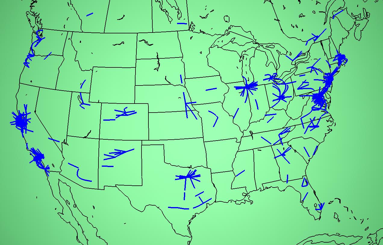
Another way to help the user understand the details of dense tunnel structures is by thresholding, where only part of the tunnel arc is drawn. The mode that we found the most useful is to elide the middle of the tunnel, leaving partial arcs ascending from each endpoint as in Figure 4.6. The thresholding technique for reducing clutter was used in previous network visualization systems [BEW95], thus it is not novel. It is a simple and obvious first choice that was effective, echoing the entire arcs-on-globe visual metaphor. We needed the thresholding capability to check for problematic areas in the American Midwest, which was hidden by the large number of tunnels between the East and West coasts.
Figure 2.6: Thresholding. Left: Long-distance tunnels that cross from coast to coast in the US obscure local endpoint details in the Midwest. Right Only the segments within a user-defined radius around the tunnel endpoints are drawn in this thresholded view, which reveals local details in the middle of the country.
We leveraged existing software whenever possible, using existing
browsers that supported linked 3D data and hypertext for display. We
created the geometric data for tunnel arcs and their associated
hypertext using a lightweight pipeline of batch modules.![]() The pipeline
phases were:
The pipeline
phases were:
No geometry for a tunnel is created in cases where we were unable to resolve a location for both its endpoints.
In order to construct the geographical representation, we need to obtain the latitude and longitude that corresponds to the IP address of each MBone router. A database maintained by InterNIC contains a geographic location for every Internet domain. Unfortunately, this information is useful only for domains with a single physical location, such as a university campus. A single contact address is not helpful for large companies with many branches, or worse yet an entire network. Even non-backbone domains such as nist.gov or csiro.au can encompass several different campuses within an organization. Since by nature many important MBone nodes belong to transit providers that cover a wide geographic area, the InterNIC-registered billing addresses for these domains are useless for individual host location data. Hosts of large administrative entities such as backbone providers are often the most critical in building a true picture of network usage.
We constructed our own database using a collection of manually intensive methods. The InterNIC database was only one source of information. Our collaborators used Web searches, network maps, traceroutes, personal communication, and personal knowledge about organizations and network structure. Despite our best efforts, the database contained inaccuracies and omissions.
traceroute
During most of the development of Planet Multicast we used the 3D viewer Geomview [PLM93] in conjunction with a slightly modified version of the WebOOGL [MMBL95] external module for handling hyperlinks. The 3D tunnel geometry contained a link to hypertext containing the IP address, hostname, location (city and state or country), and latitude and longitude of the tunnel endpoints. Providing detail on demand is a standard information visualization technique [Shn96], but doing so via hypertext was novel at the time.
Geomview has the navigational capability necessary for the oblique horizon view, and supports interactive changes of color, linewidth, and position for named groups. We also made the interactive 3D maps available in VRML [CM97b] using the existing Geomview-to-VRML converter. Although most VRML browsers were less capable than Geomview in that they did not support the preceding features, they did at least allow users to spin the globe around and see the hyperlinked information by clicking on the tunnel arcs. (In 1996, ubiquitous multiplatform support for VRML seemed near, but as of 2000 it has not lived up to that promise.)
We used Geomview for exploratory interactive analysis of tunnel groups, usually using the high-end SGI version for display of high resolution data at interactive frame rates. Useful configurations of color and linewidth coding were then exported via VRML by rerunning the pipeline and hardcoding in the color and linewidth values that were found during a previous interactive session. The VRML files that we exported for wide dissemination usually contained lower resolution data, with fewer segments for both the continental outlines and the arcs. We assumed that most of the VRML users would have lower-end systems could not maintain reasonable frame rates with a large number of short line segments.
The Planet Multicast software is publicly available.![]()
We believed that disseminating 3D data files would allow maintainers to interactively explore the MBone structure and gain clearer understanding of the problems and possible solutions than would be available from still pictures or even videos. The Planet Multicast visualization software did provide one MBone maintainer with some insights into the topology of the MBone in 1996, and was used in a few additional networking visualization task domains. However, the system was never fully deployed because of scalability problems with geographic determination, and it is not currently in active use by its target audience.
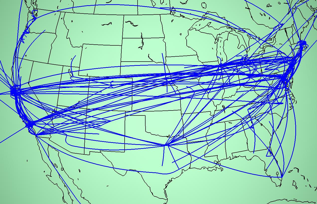
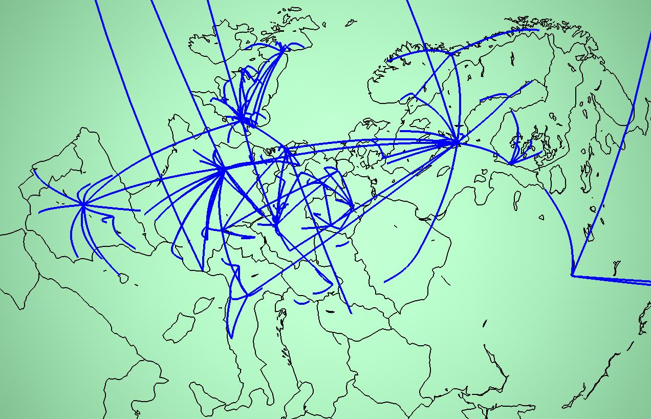
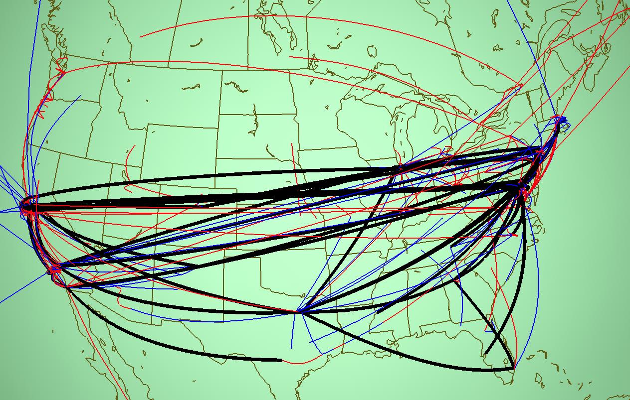
The most obvious conclusion about the general character of MBone deployment in 1996 was that areas with fewer network resources and limited numbers of redundant links seem to have more efficient tunnel placements. The European tunnel structure shown in Figure 4.7 is much closer to a hierarchical distribution tree than that of the United States. The commercialization of the US-based Internet in the mid-1990's led to the fragmentation of the formerly hierarchical US structure.
Figure 2.7 Two regional closeup views of the MBone. Left: United States tunnel structure. Right: European tunnel structure. The US tunnel structure is quite redundant compared to the European one. Reducing the number of coast-to-coast tunnels would reduce the offered workload to the often congested underlying unicast infrastructure. Many of these tunnels may be carrying identical data.
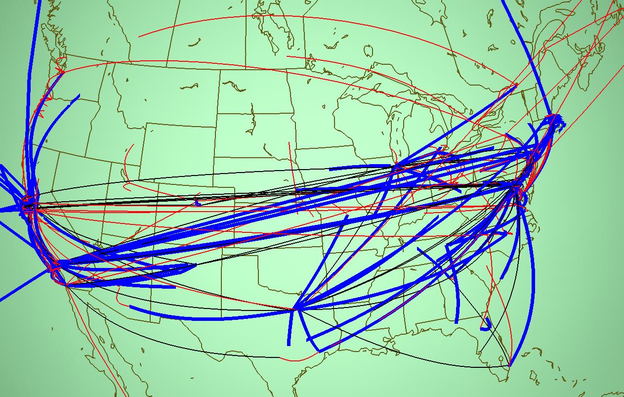
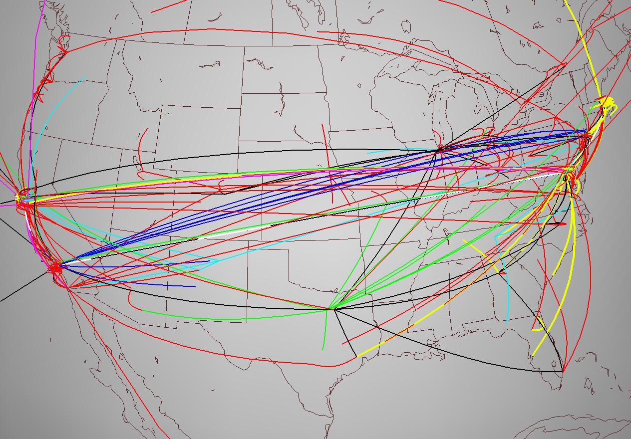
The US topology seemed to be highly nonoptimal at first glance. Although the MBone maintainers knew that there were some redundant tunnels, the sheer number of coast-to-coast tunnels visible with the Planet Multicast display was surprising even to them. We split the tunnels into groups according to the major Internet Service Provider (ISP) backbones to investigate further. Figure 4.8 shows the tunnels partitioned into three sets: both tunnel endpoints belong to a major backbone (black), one endpoint is on a backbone and the other is not (blue), or neither endpoint connects directly to a backbone (red). We learned two lessons from the color coding: first, some of the redundancy may be legitimate, in the cases where the long-distance tunnels belong to major national backbones. Second, many of the long-distance tunnels are not directly under the control of the backbones, and these are good candidates for further investigation by the MBone maintainers.
We then drilled down to further understand the status of the first
group, namely the major backbones colored black in the previous figure.
Figure 4.9 shows the dataset partitioned
further, by color-coding the groups corresponding to each backbone
ISP.![]() The
combination of color and linewidth coding, interactive navigation, and
moving groups away from the central mass to quickly see hidden
structure allowed us to confirm that the each individual backbone had a
quite reasonable topology with little redundancy. It would have
been much harder to make sense of the structures with only a 2D
birdseye view, or tunnels that could not be quickly moved in and out
of position.
The
combination of color and linewidth coding, interactive navigation, and
moving groups away from the central mass to quickly see hidden
structure allowed us to confirm that the each individual backbone had a
quite reasonable topology with little redundancy. It would have
been much harder to make sense of the structures with only a 2D
birdseye view, or tunnels that could not be quickly moved in and out
of position.
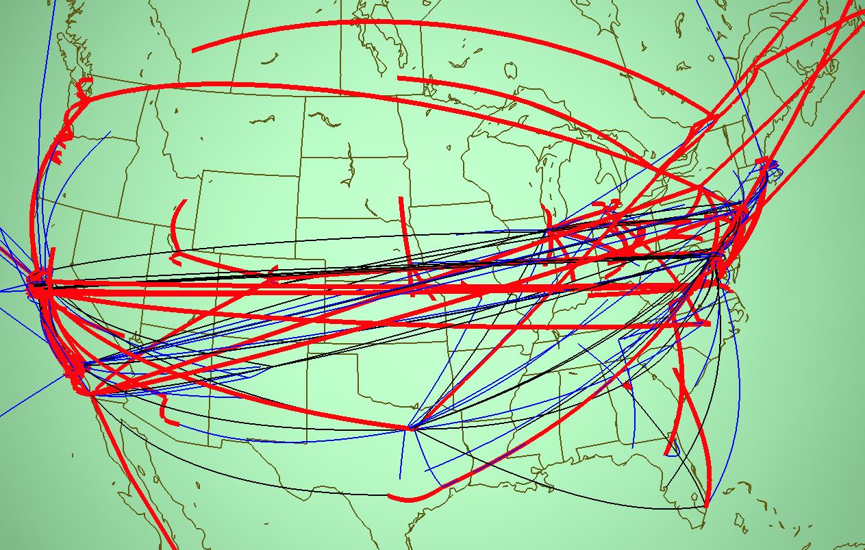
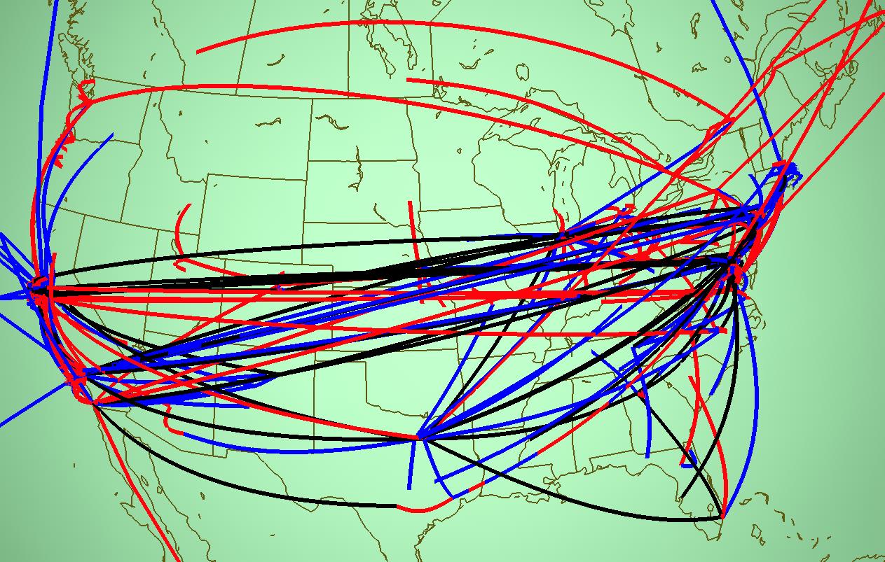
Figure 2.8: MBone tunnels grouped by backbone status. Here we show the United States in June 1996, which is the same data as the right side of Figure 4.7. Groups are color-coded according to whether tunnel endpoints are belong to a major backbone Internet Service Provider. We sought to understand whether the profusion of coast-to-coast tunnels was excessively redundant or a reasonable consequence of the commercialization of the US backbone. Top Left: Black tunnels, which have a major provider at both ends, are emphasized. If most of the long tunnels were black, then the redundancy might be quite reasonable. Top Right: Blue tunnels, which have one endpoint on a backbone and one endpoint in a non-backbone domain, are emphasized. These tunnels are possibly legitimate, since ISP network administrators are presumably more motivated to make sure that their bandwidth is not being wasted than an average corporate or university sysadmin. Bottom Left: Red tunnels, which have neither endpoint on a major backbone, are emphasized. These are prime targets for suspicion, and there are a distressingly large number of them. Bottom Right: All three groups are equally emphasized with the same line weight, so that their relative sizes can be compared visually.
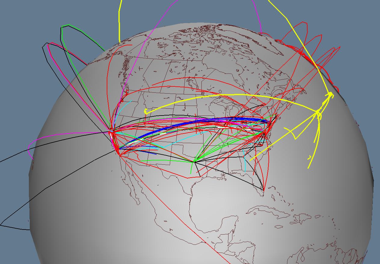

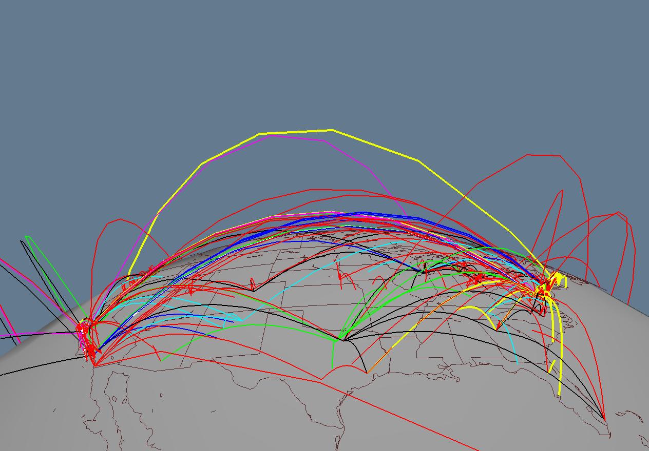
Figure 2.9: MBone tunnels of the major backbone networks, colored by provider. We show the same data (United States, June 1996) as Figure 4.8, but drill down further by grouping according to the backbones themselves to check that no individual backbone has excessive redundancy. The tunnel color coding is black for MCI, green for Sprintlink, blue for ANS, cyan for ESnet, magenta for NASA, yellow for BBNPlanet, and white for Dartnet. These tunnels correspond to the groups colored black and blue in Figure 4.8. Tunnels that are not connected to backbones are colored in red in both that figure and this one. Top Left: Everything from a birdseye view. Top Right: A horizon view takes advantage of the varying arc height to make the structure more obvious. Bottom Left: We move the BBN tunnels away from the main mass to see them more clearly, and the aggregate bicoastal structure is still obvious even though they are no longer anchored to their true geographic location. Bottom Right: We have interactively elided the red non-backbone tunnels, showing that each individual backbone has a reasonable structure when considered alone.
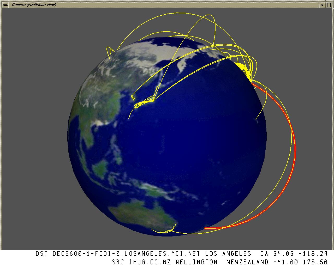
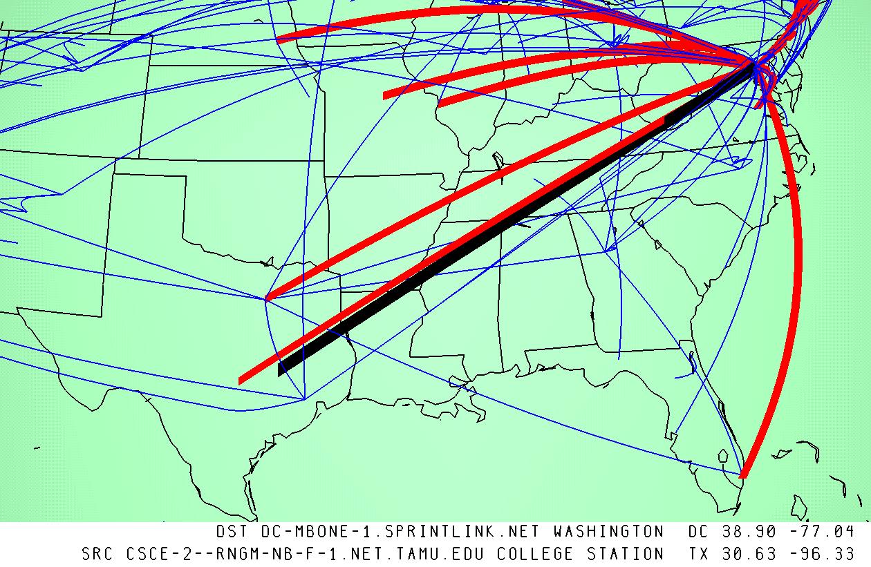
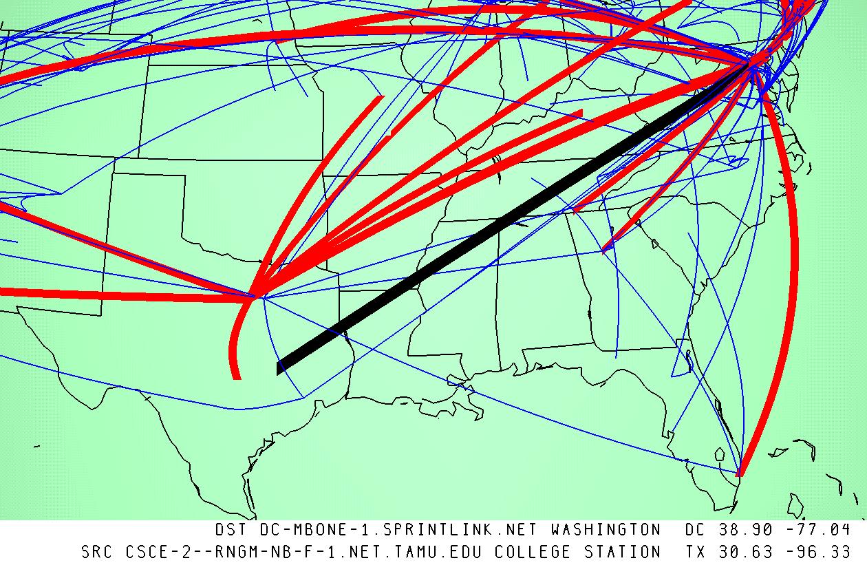
Figure 2.10: MBone tunnel structure in Texas at two different times. Left: February 12, 1996. Right: June 15, 1996. Tunnels in the Sprintlink network are drawn in thicker red arcs in both, and the selection of a tunnel between Texas A&M University and Washington, DC is shown with a thick black arc. In the later picture we see that although Sprint has established a major new hub close to TAMU, that closer source is still unleveraged in June.
All figures thus far have shown the MBone on the same day, in June 1996. Figure 4.10 compares the changes in the MBone across a four-month period of time. In both figures we highlight the Sprintlink tunnels and focus on Texas. We saw that in February Texas A&M University (TAMU) had configured a tunnel to a Sprint hub in Washington DC. We noticed that by June Sprint had extended their tunnel support to a major hub in Fort Worth, but the university had not leveraged the new topology and still tunnelled all the way to the East Coast instead of using the nearby hub. In a situation where TAMU and some other Sprintlink customer in Texas were both subscribed to the same multicast channel, it is likely that identical multicast packets would be routed through both tunnels. In the worst case, those packets might even traverse the same underlying unicast link. If the channel were high-bandwidth video, for instance a space shuttle launch, the result would be congestion. This situation is an example of a tunnel placement problem that had gone unnoticed in the text input data, but was easily found with the geographic visualization.
Both the pipeline software and the geographic databases that we developed have been used for the visualization of other network topologies.
We used the toolkit ourselves to visualize the traffic load on the
Squid![]() global web caching hierarchy
[Wes96], visually encoding the traffic information by coloring
arcs between parent and child caches. We used the toolkit for over a
year as part of a nightly batch process to create a web page with
images and VRML files showing the previous day's cache
usage.
global web caching hierarchy
[Wes96], visually encoding the traffic information by coloring
arcs between parent and child caches. We used the toolkit for over a
year as part of a nightly batch process to create a web page with
images and VRML files showing the previous day's cache
usage.![]() However,
this page is no longer active because the cache usage information is
now being gathered differently.
However,
this page is no longer active because the cache usage information is
now being gathered differently.
In another case, the Planet Multicast toolkit was used by Andrew Hoag
of NASA-Ames to show the geographic structure of the emerging
6Bone.![]() The 6Bone, like the MBone, is way to deploy a new network service
gradually through tunnels. In this case, the service is IPv6
[DH98], the new version of the Internet Protocol. Hoag started using
our toolkit to create his own page in late 1996, but since he is no
longer at Ames the interactive 3D maps are no longer current.
The 6Bone, like the MBone, is way to deploy a new network service
gradually through tunnels. In this case, the service is IPv6
[DH98], the new version of the Internet Protocol. Hoag started using
our toolkit to create his own page in late 1996, but since he is no
longer at Ames the interactive 3D maps are no longer current.
The deployment of a system such as the MBone should be a careful balance between distribution efficiency, resource availability, redundancy in case of failure, and administrative policy. Our hope was that this visualization system would help ISPs and administrators of campus networks cope with a growing infrastructure by illustrating where optimizations or more appropriate redundancies could occur within and across network boundaries. When Bill Fenner, who is heavily involved with MBone deployment, saw the initial 3D visualization in February 1996, he was galvanized to encourage many administrators of suboptimal tunnels to improve their configuration. Although he was familiar with the textual data, the geographic visualization highlighted specific problems in the distribution framework that he had not previously noticed.
The 3D visualizations were primarily intended for people working in the MBone engineering process because their interpretation requires a great deal of operational context. Although they could be misleading if seen as standalone images by those without a broad understanding of the underlying technologies, they can serve as an educational medium for the general public with appropriate interpretation.
We hoped that these visualizations would encourage network providers to make available geographic, topological, and performance information for use in visualizations that could facilitate Internet engineering on large and small scales. Although our toolkit was also used for a few other networking visualization projects, it is not currently in active use by MBone maintainers. In the next section we discuss the barriers to adoption that prevented its deployment to the MBone maintenance community. We thus have no data about the response of our intended users to the visual metaphor.
The main stumbling block to widespread adoption was the nonscalability of our necessarily ad-hoc geographic determination techniques. Although it was possible to glean most of the necessary information for the MBone circa 1996, these methods were infeasible for the larger Internet or even the MBone after 1997. We made our database publicly available in hopes that it would become self-sustaining through enlightened self-interest. We anticipated that a bootstrap database, despite its imperfections, would gain support from ISPs who would find enough benefits that they would contribute their internal (presumably accurate and up-to-date) data to maintain and improve it. Although our hopes proved to be somewhat optimistic, K. Claffy of CAIDA has continued to add to and maintain the database, and has indeed received some ISP data. Although we have not personally continued with this line of research, her group has built on our 1996 results in more recent projects [PN99,Net99,CH].
Geographic techniques will probably have only limited applicability for showing global MBone or Internet network infrastructure as long as geographic locations for routers are hard to discover. However, these techniques may work for corporate or otherwise proprietary networks where internal documentation of router locations is available. This approach is probably also appropriate for showing final destinations such as Web servers, since geographic information for Web servers is much more likely to be correct than for routers inside backbone networks.
Another obstacle to widespread adoption was that VRML viewer deployment was not as ubiquitous as we had expected. Although somewhat stable viewers exist for most platforms now, most network maintainers do not have them installed on their machines. The VRML movement has definitely lost momentum compared to its heyday, because of many shortfalls during a critical window of time: browsers were insufficiently stable, end-user machines lacked sufficient bandwidth and graphics power, and no compelling application appeared to drive a non-gaming consumer market for 3D.